El gran escenario
de las emociones
Art Direction & Campaign Design
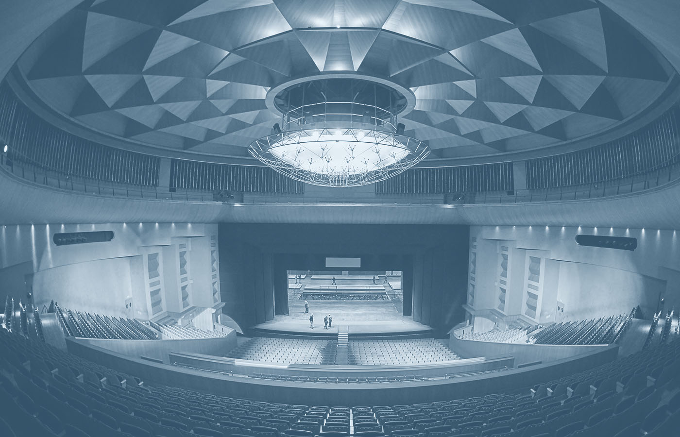
The Teatro de la Maestranza, designed to be one of the primary cultural venues for the Seville Expo ’92, holds a distinguished position as the most important opera house in Andalusia, Spain. Situated in front of the Guadalquivir river, it stands as an astonishing and majestic architectural gem, offering a rich array of performances including opera, dance, symphonic concerts, solo recitals, renowned international artists, flamenco, and chamber music.
Seeking a design transformation, the opera house directors aimed to announce the 2019 season in a grand manner, flooding the city of Seville with billboards, flags, and buses to ensure every citizen knew that the Teatro de la Maestranza was back in full swing.
Gold Anuaria – Best Advertising Campaign
Anuaria Awards (2020)
Advertiser of the Year
Agripina Awards IX (2019)
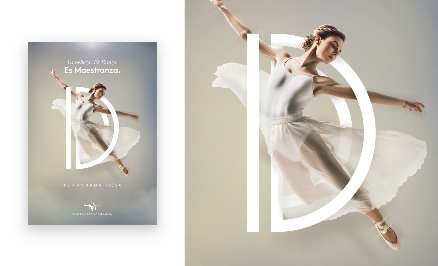
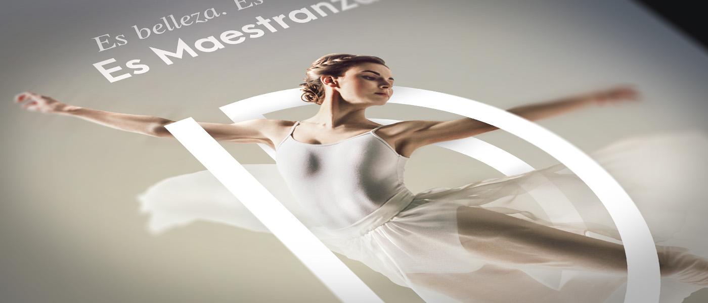
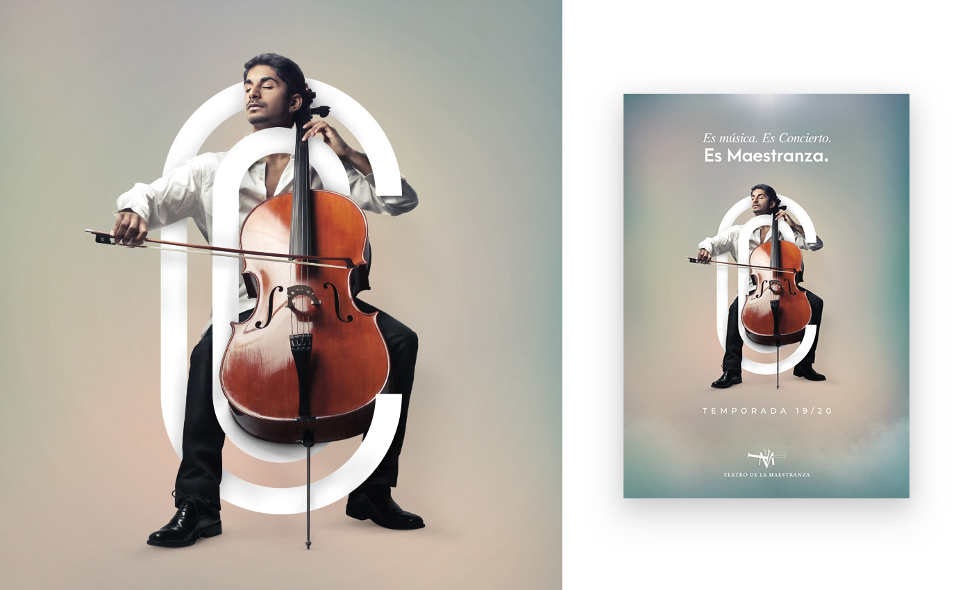
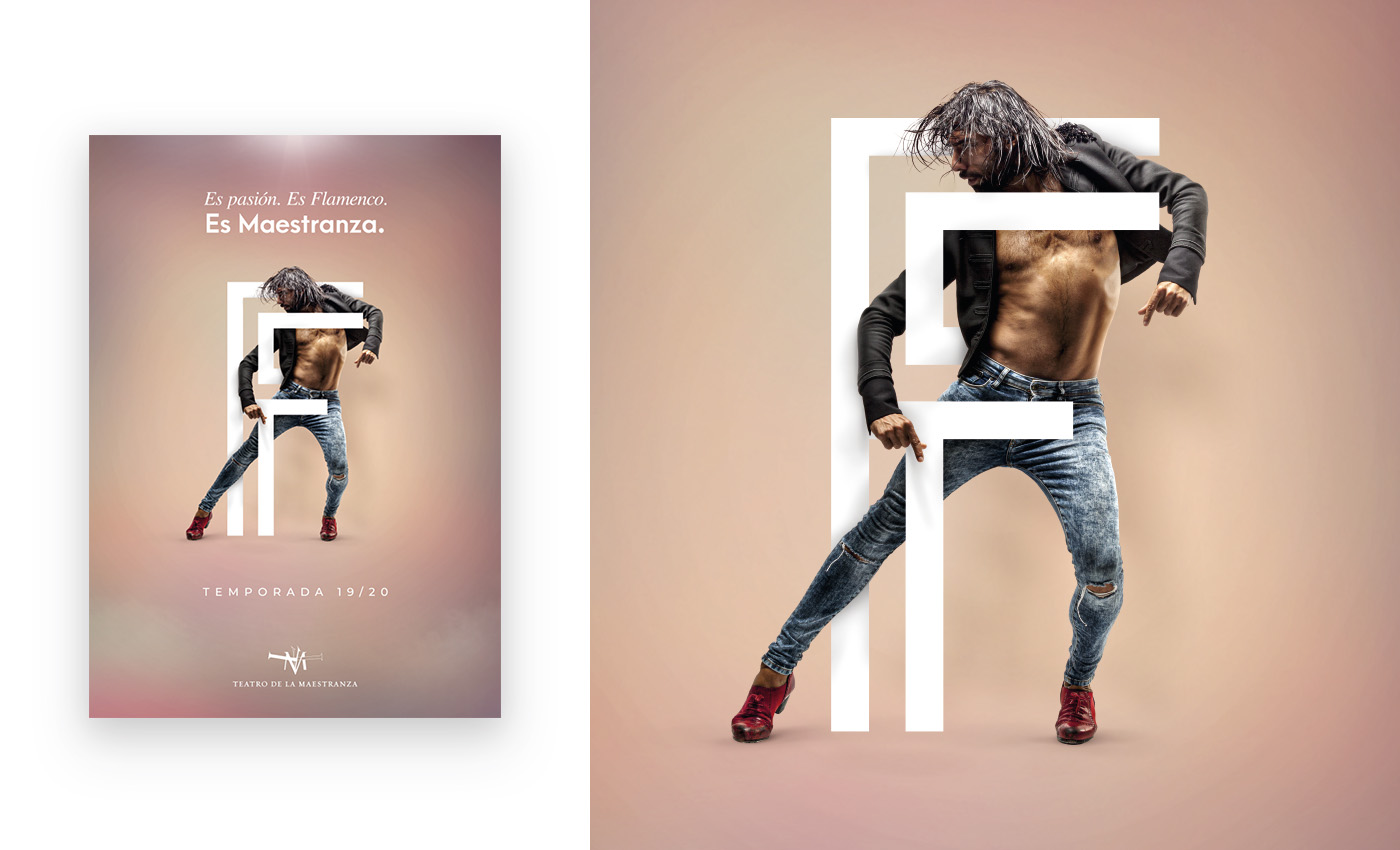
The Concept
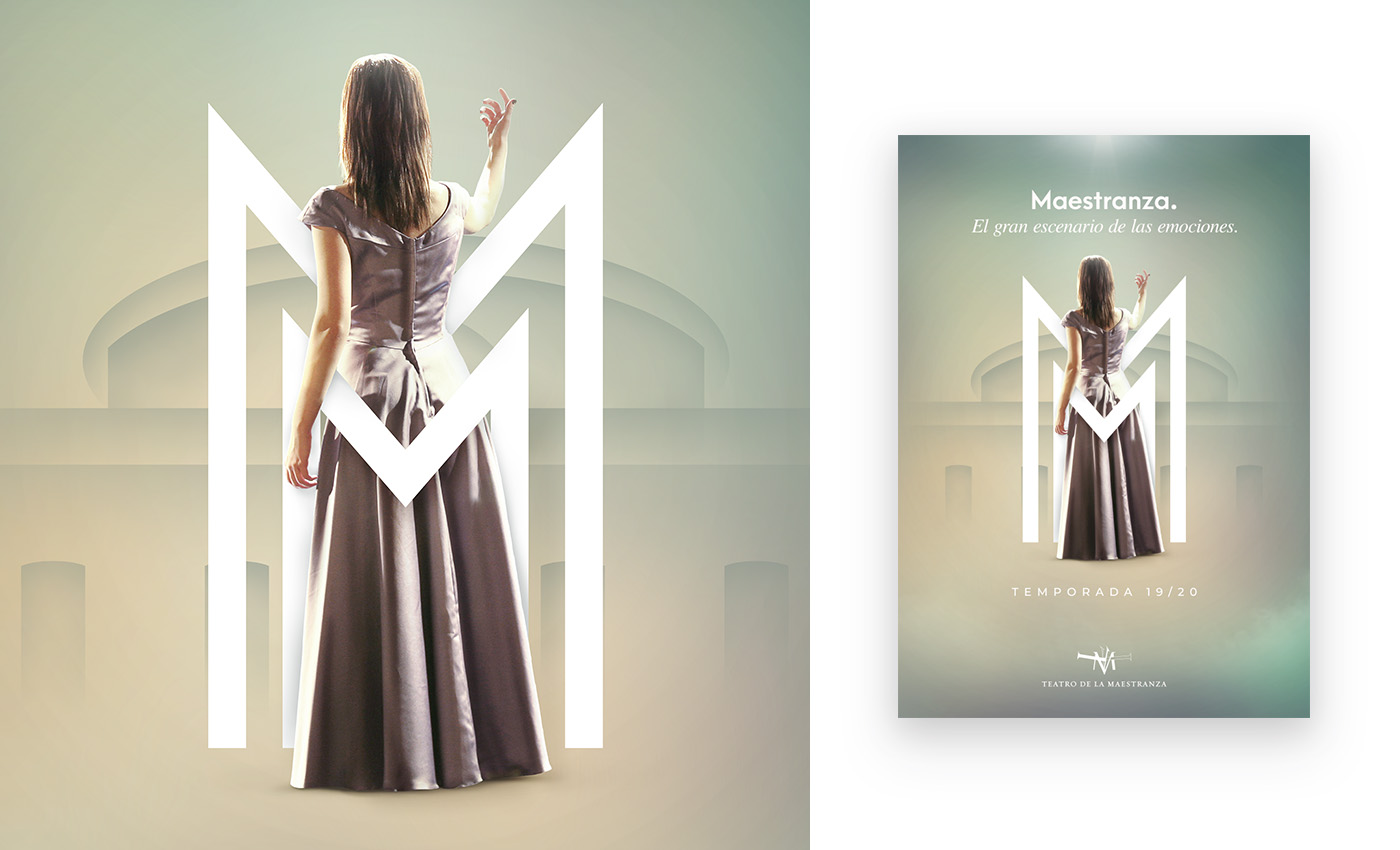
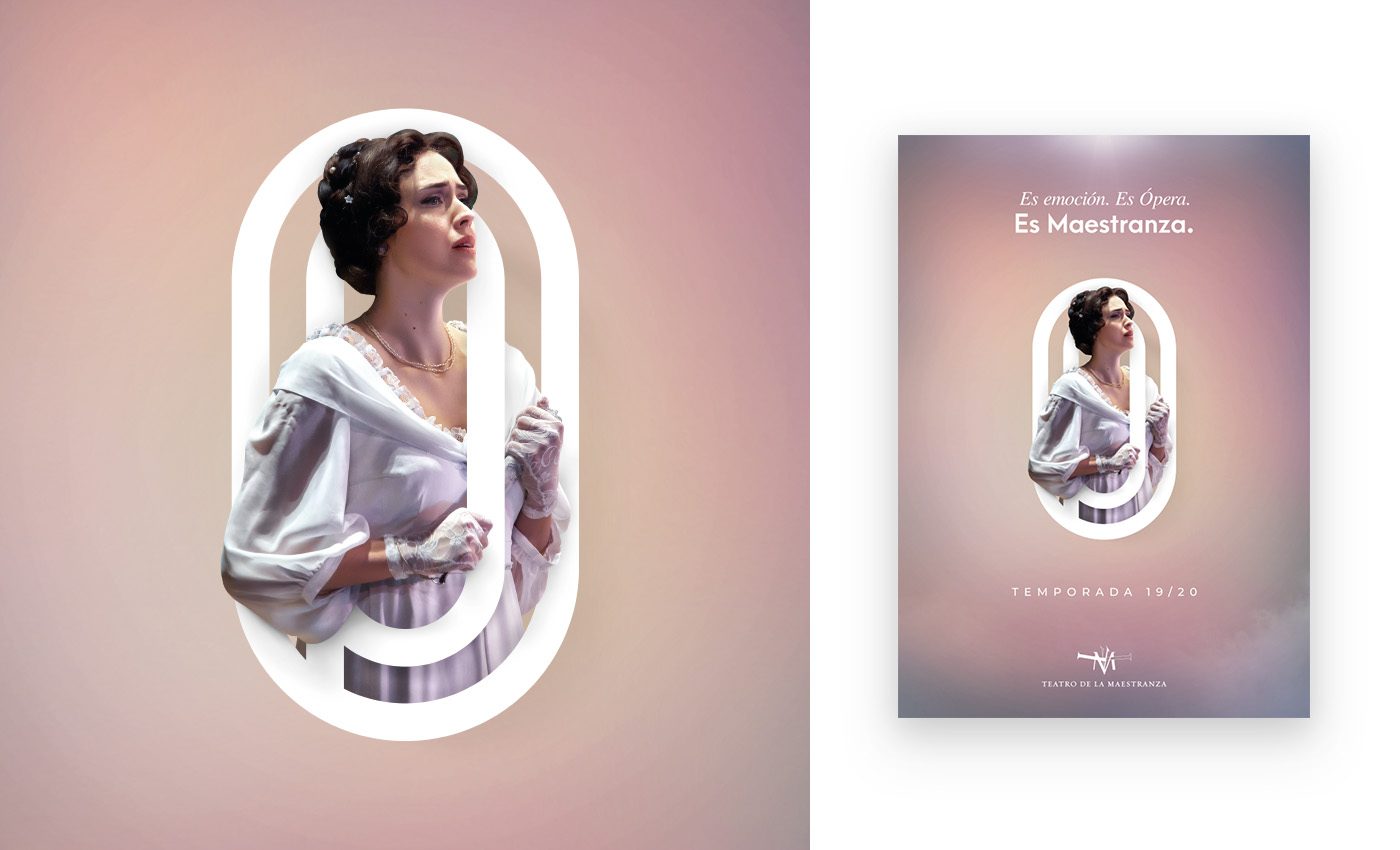
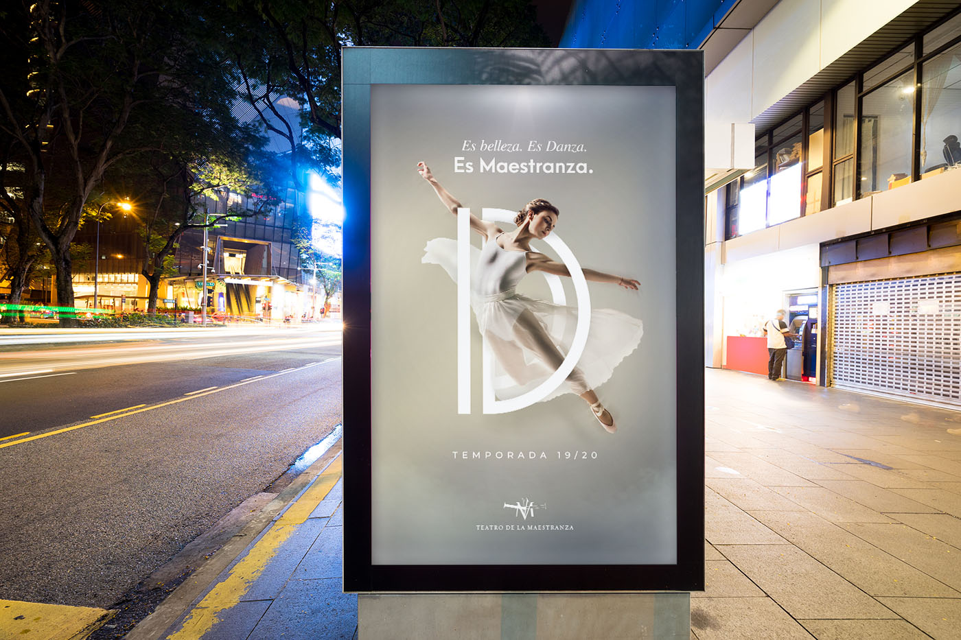
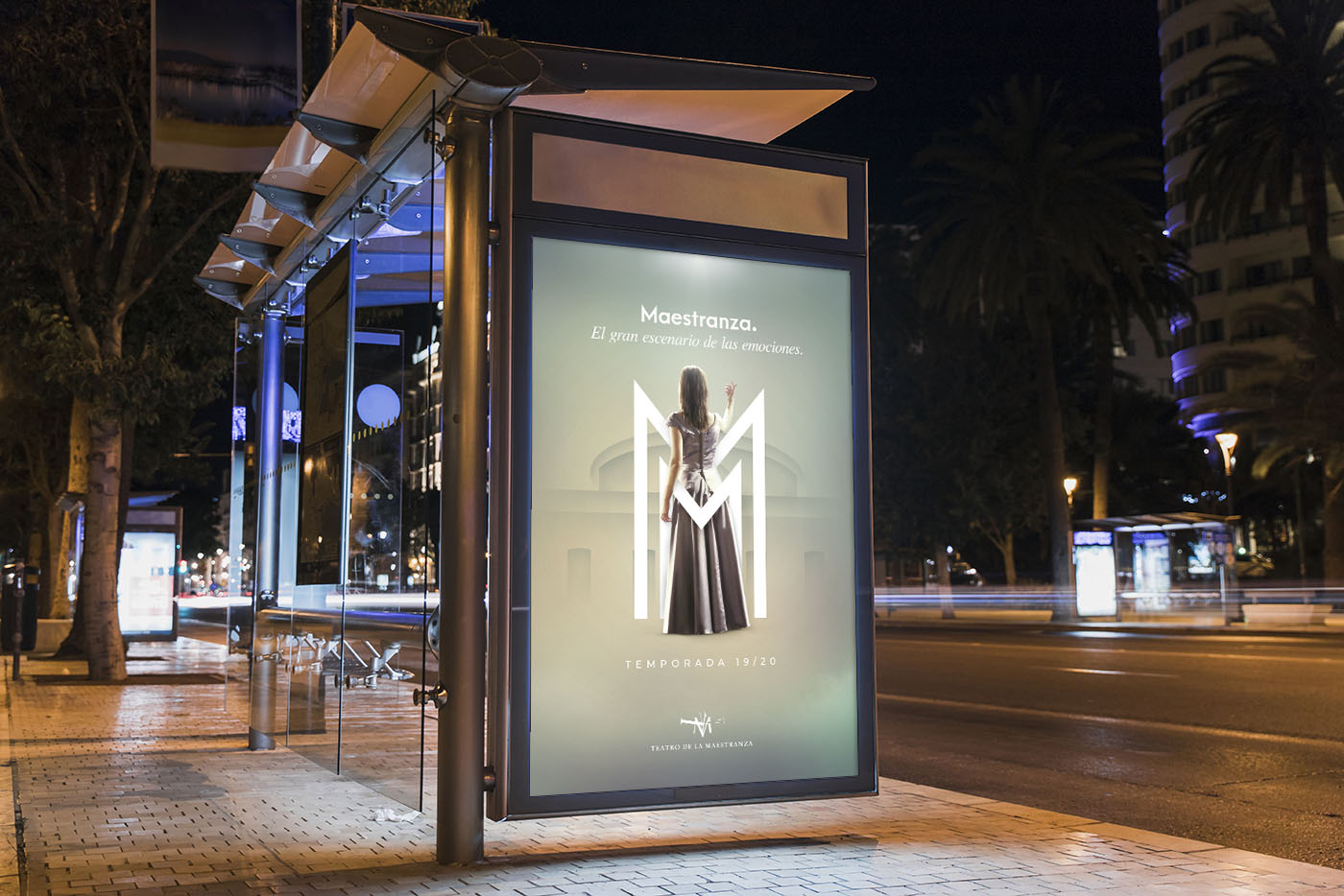
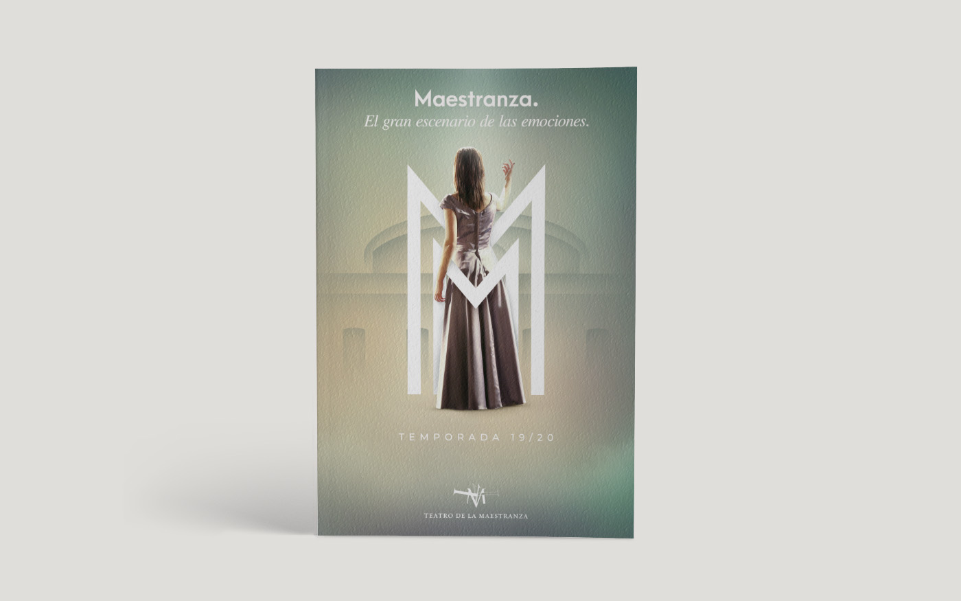
The main idea was to capture the elegance and emotion of a particular moment from a spectacle. To attract attention, especially from younger generations, a bold yet lightweight central composition with subtle background colors was designed. Each capital letter represented the main types of performances: Dance, Flamenco, Opera, and Concert. The letter “M” stands for Maestranza, serving as the institution’s master corporate initial.
The Great Stage of Emotions.
Each poster’s copywriting was crafted to evoke the emotions and feelings experienced during the various spectacles, serving as descriptive adjectives for the theater itself. The design aimed to create a captivating ambiance by blending classic and modern fonts, incorporating unique gradients, smoke and lighting effects. This approach gave rise to a distinctive visual language that effectively conveyed the essence of the campaign.

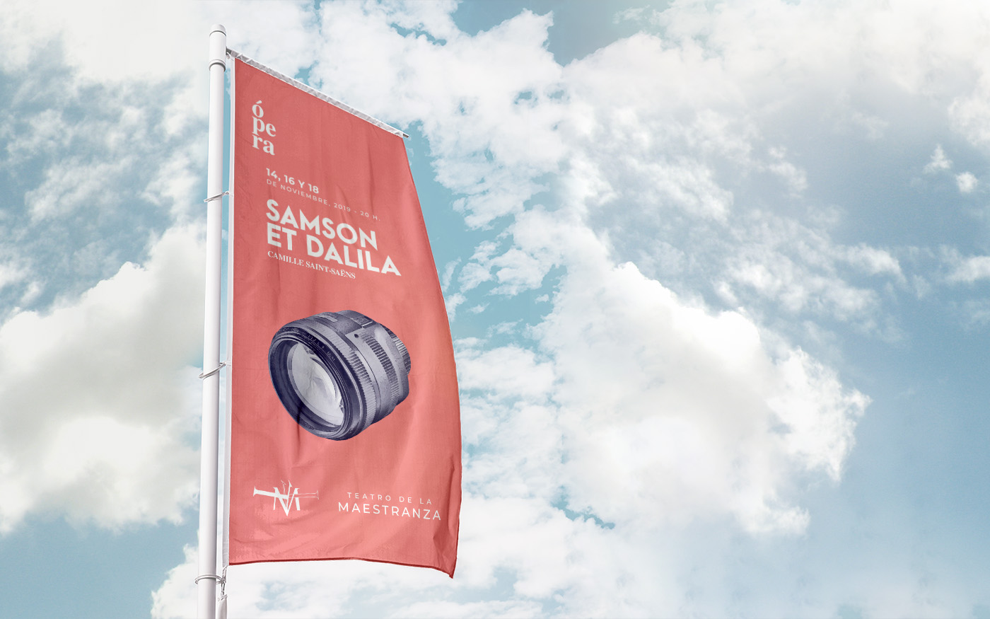
Outdoor Banners
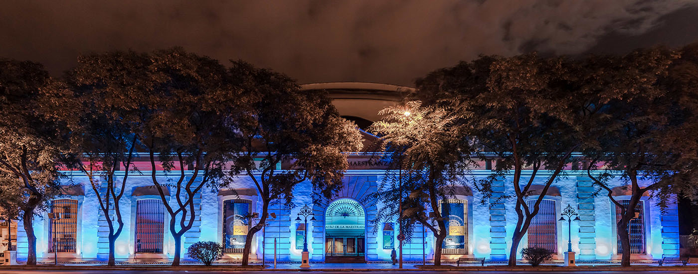
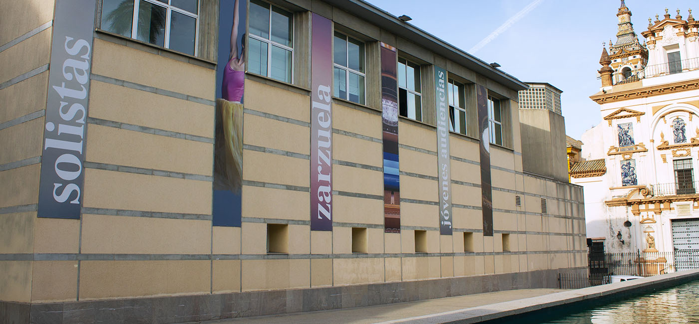
The building exterior features 16 structures designed to hang banners, each towering over 7 meters in height, along with 6 massive front windows. Due to the considerable cost involved in changing the banners frequently, the institution required a collection of images or elements that could endure for years and seamlessly coexist with future campaigns and seasonal changes.
The front windows were adorned with the five season’s posters, serving as a way to both conceal and enhance the building’s classical architecture throughout the year. Initially, the banners were intended to cover the entire windows; however, due to budget cuts, they were ultimately designed to occupy only half of their height.



The Booklet
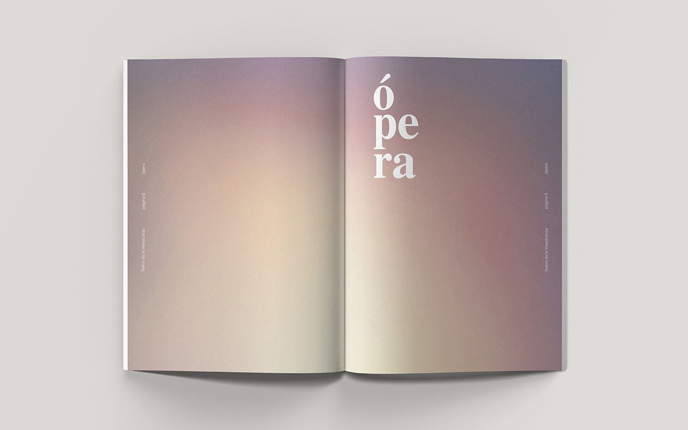
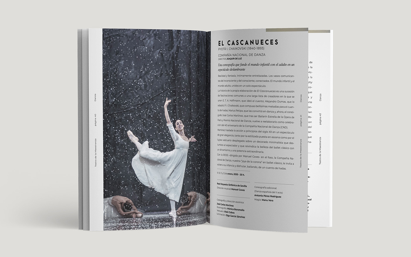
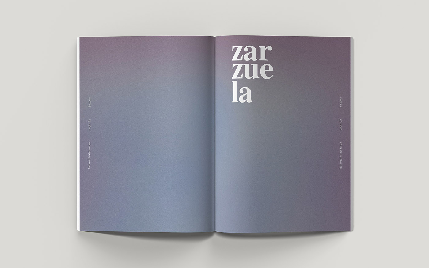
A comprehensive booklet spanning over 80 pages was designed to encompass all the necessary information about the spectacles, including advertisements and details about ticket and subscription sales. The layout was kept simple and clear, featuring prominent images. The use of gradients was integrated as section separators and subtle details on the page margins.
The pages were printed on a soft, medium-weight white paper, while the cover was crafted using textured paper to elevate the tactile experience of the booklet. The design of the background gradients aimed to mimic the appearance of a real watercolor painting, adding a touch of artistic charm to the overall presentation.
The Four Operas
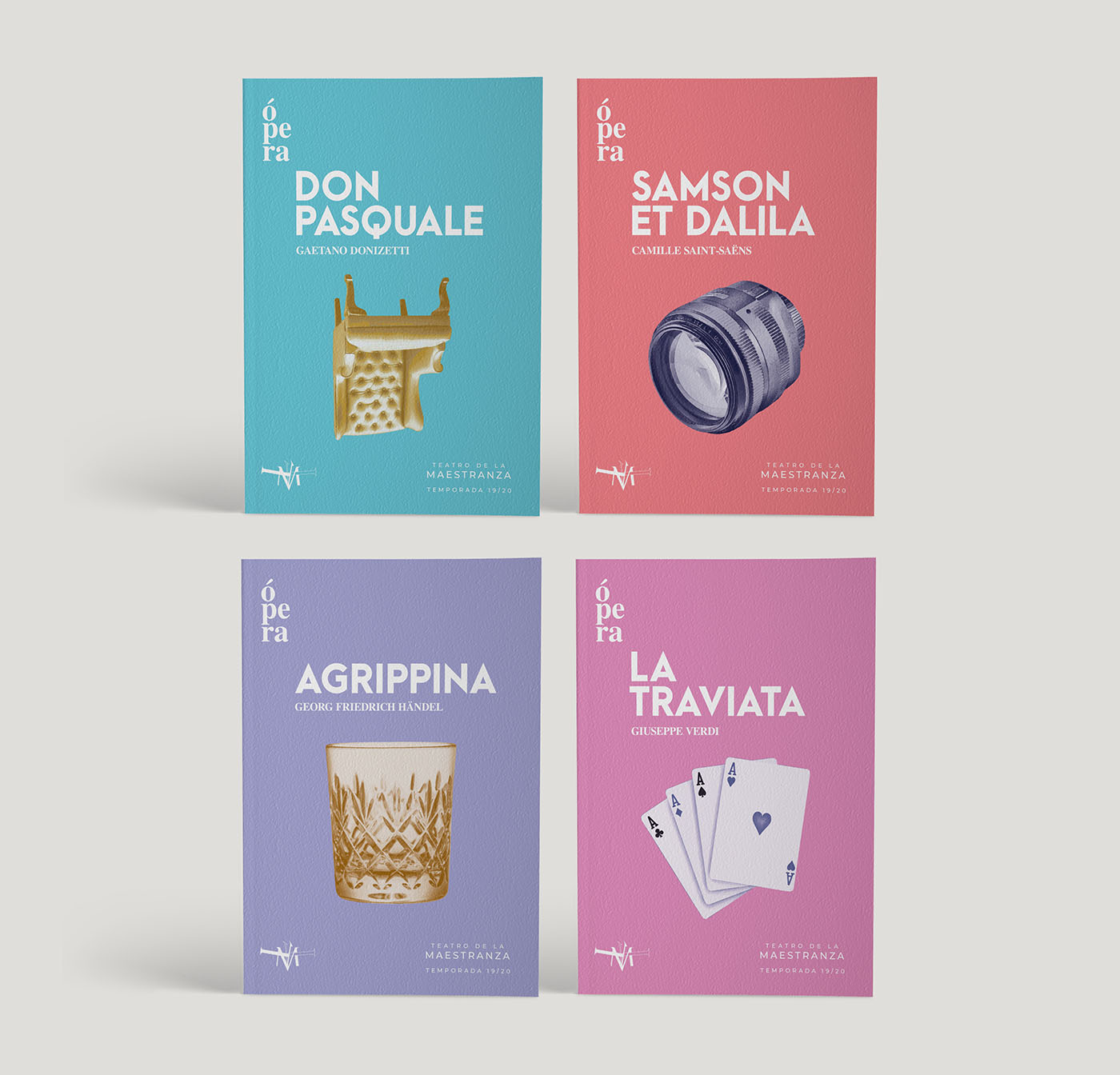
During the season, four major operas were scheduled, and the theater aimed to highlight them as special events. To achieve this, an eye-catching variant of the original style was utilized, featuring vibrant contrasting colors and watercolor-like illustrations of key elements from each play.
Each opera had its own booklet, printed with the same materials and finish as the general booklet. Together, they formed a colorful collection that could be kept as a souvenir. Additionally, to build anticipation, the entire avenue where the theater is located was adorned with flags every time an opera was about to premiere.
